Helping Businesses Build Better Digital Products Worldwide

What is digital product design? Process, Principles, and Real Examples

Most digital products don’t fail because of bad engineering. They fail because nobody stopped to figure out what users actually needed before building anything.
That’s the short version of why digital product design exists. The longer version involves user research, wireframes, prototypes, testing rounds, and a lot of iteration before anything ships. According to McKinsey’s Design Index, companies with strong design practices outperform industry benchmarks by as much as 2x on revenue growth. That’s not luck.
So what is digital product design? It’s the discipline of shaping how apps, websites, SaaS platforms, and other digital tools look, feel, and function. It covers UX strategy, visual design, interaction patterns, and usability testing all working together. If you’re a founder, product manager, or business owner trying to figure out whether this matters for you, it does. Agencies like https://uxorbit.in/ do this work every day for startups and scaling businesses, and the difference it makes in conversion and retention is hard to overstate.
What Digital Product Design Actually Means
Digital product design is the end-to-end practice of defining, creating, and refining digital experiences. That includes everything from the first user interview to the final UI component handed off to a developer.
It’s not just “making it look nice.” That’s a frustratingly common misconception, and it costs companies real money. The discipline sits at the intersection of user psychology, business goals, and technical constraints. A skilled digital product designer isn’t just a visual artist – they’re a researcher, a strategist, and occasionally a detective trying to figure out why users keep dropping off at step three of your onboarding flow.
Think about it this way: a physical product designer shapes how a chair feels to sit in. A digital product designer shapes how it feels to use your software at 9am on a Tuesday. Both jobs require the same kind of empathy. One just happens on a screen.
What the discipline typically covers:
- User research and persona development
- Information architecture and user flows
- Wireframing and low-fidelity prototyping
- Visual and UI design
- Usability testing and iteration
- Developer handoff with documented specs
None of these steps are optional. Skip research and you’re designing for assumptions. Skip testing and you’re shipping problems that support tickets will eventually surface anyway.
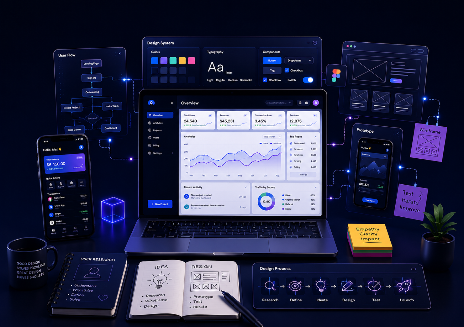
The Digital Product Design Process, Step by Step
The digital product design process is messier in practice than any diagram suggests. It loops back constantly. New research breaks your wireframes. A usability test reveals that the navigation you spent two weeks on confuses everyone. That’s fine – that’s the point of the process.
Loosely, it runs like this:
Discovery and research – Talk to users before designing anything. This phase covers interviews, competitor analysis, and defining the actual problem. What role does design thinking play in digital product design? It starts here. Without a clear problem definition, everything downstream is guesswork.
Define and structure – Map out user flows, build information architecture, and create personas. Unglamorous work. But it’s what determines whether users can find things later without a tutorial.
Wireframing – Low-fidelity layouts that show structure without visual polish. This is where structural problems get caught before anyone’s invested hours in pixel-perfect mockups. Cheaper to fix a wireframe than a finished design.
Prototyping and visual design – Now it gets visual. High-fidelity prototypes that look and behave like the real product. Color systems, typography, interaction states, micro-animations – this is where the experience comes alive.
Testing and iteration – Put the prototype in front of real users. Watch where they hesitate. Note what they ignore. Fix it and test again.
Handoff – Design files, component libraries, and detailed specs handed to developers. A messy handoff wastes weeks of engineering time. A clean one doesn’t.
Core Principles Every Designer Lives By
A lot of articles give you a list of twelve principles that all mean the same thing. Let’s keep it practical.
Clarity over cleverness. Users don’t read your UI. They scan it, guess at things, and click around until something works. Your product needs to communicate its purpose without any explanation required. If someone needs a tutorial to complete the main action, the design failed.
Consistency. If a button does X on screen one, it needs to do X everywhere. Inconsistency is the fastest way to make users feel like they can’t trust your product. It’s also the most common complaint in one-star app reviews.
Feedback loops. Every action deserves a reaction. Loading indicators, success messages, error states, hover effects – these aren’t extras. A user who clicks a button and sees nothing will click it again, then twice more, then leave. This is genuinely one of the most underrated parts of interaction design.
Accessibility. Not just WCAG compliance, though you should care about that. It’s about not excluding people from your product entirely. Color contrast, keyboard navigation, proper alt text – basics that get deprioritized and then cause headaches later.
UI Design vs. UX Design vs. Digital Product Design
| Dimension | UX Design | UI Design | Digital Product Design |
| Focus | User flows and usability | Visual layer and interface | End-to-end product strategy and execution |
| Key outputs | User flows, wireframes, journey maps | Style guides, mockups, component libraries | Research, architecture, prototypes, UI, handoff |
| Role in process | Mid-process, structure and flow | Later-stage, visual execution | Full lifecycle, from discovery to delivery |
| Typical seniority | Mid to senior | Mid | Senior, often strategic |
| Business involvement | Moderate | Low | High |
UX design is one part of digital product design. UI design is another part. The full discipline wraps around both and adds research, strategy, and business alignment on top. The mistake teams make is hiring a UI designer when they need a product designer, then wondering why the beautiful interface they shipped isn’t converting.
Digital Product Design Examples Worth Studying
Real digital product design examples teach more than theory ever will.
Notion looks simple. The actual design work underneath it—how blocks behave, how databases connect, and how new users onboard without immediately quitting—is anything but. Notion’s team has spoken publicly about how many iterations the sidebar alone went through before it felt right.
Figma is a design tool that’s beautifully designed itself. The multiplayer collaboration model required rethinking how multiple cursors, comments, and nested components coexist without chaos. That’s a design problem, not just an engineering one.
Duolingo – every streak notification, every owl animation, and every “7-day streak” prompt is a deliberate design choice. Their retention numbers are exceptional. The gamification mechanics behind them aren’t accidental.
What these three share: obsessive user research before any visual polish. Relentless iteration after launch. And a team culture where design isn’t an afterthought.
How UXOrbit Helps With Digital Product Design
If you’re thinking about what your own product actually needs, https://uxorbit.in/ is worth a serious look.
UXOrbit is a UI/UX design agency focused specifically on helping startups and growing businesses design digital products that convert and retain users. They work across the full digital product design services spectrum, which means you’re not piecing together a research freelancer, a UX designer, and a visual designer separately.
Their work covers:
· SaaS product design – Onboarding flows, dashboard architecture, and feature UI that helps users reach value quickly
· Website and landing page design – Built around conversion, not just aesthetics
· Mobile app UX – Native and cross-platform, with accessibility baked in from the start
· Design audits – If you have an existing product underperforming, they’ll identify exactly where and why
· End-to-end digital product design services for startups building from scratch and scaling teams that need senior design support without hiring full-time
The approach at UXOrbit starts with research, not assumptions. That matters more than most clients realize until they’ve seen the difference it makes in actual user behavior.
Book a free discovery call at UXOrbit and tell them what you’re building.
AI and the Future of Digital Product Design
Can AI replace digital product designers? Honestly, that’s the question everyone in the industry is currently arguing about in Slack channels and conference panels.
Short answer: not in the way people fear.
Here’s what’s actually happening. AI tools like Galileo AI, Figma’s AI features, and generative design assistants are speeding up specific parts of the process. Generating layout options, suggesting color systems, and writing microcopy variations—these tasks are genuinely faster with AI assistance. A designer who ignores these tools is leaving real efficiency on the table.
But the hard parts are still human. Understanding what users actually need when they can’t articulate it. Making judgment calls about when to break conventions. Deciding what a product’s personality should feel like. AI doesn’t run usability tests. It doesn’t notice that a user’s expression shifts to confusion at step three of the onboarding flow.
How is AI changing digital product design? It’s accelerating production and lowering iteration costs. What are the latest digital product design trends? AI-assisted prototyping, voice interfaces, and adaptive personalized UX are all gaining serious traction right now.
What is the future of digital product design? Probably a world where designers who embrace AI tools work significantly faster than those who don’t not a world where AI makes designers irrelevant. The judgment, empathy, and strategy still require humans.
Frequently Asked Questions
It’s the practice of designing how digital products, apps, websites, SaaS tools, and platforms look, feel, and function. The process covers user research, UX, visual design, prototyping, and testing. The goal is products that real people actually want to use, not just products that technically work.
A digital product designer handles user research, information architecture, wireframing, visual design, and developer handoff. They’re not just creating screens – they’re making strategic decisions about how the product communicates with its users at every step.
Depends entirely on scope. A focused landing page redesign might take two weeks. A full SaaS product from discovery through handoff can run three to six months for complex products. Rushing this process almost always creates more expensive problems post-launch.
UX design is one component within digital product design. Product design is broader – it includes UX, visual design, business strategy alignment, and often input on the product roadmap. A digital product designer typically carries more seniority and is involved in decisions UX designers don’t own.
It varies a lot. Freelancers charge $50-$150/hour on average. Design agencies range from around $5,000 for a focused engagement to $50,000+ for a full-scope product. The more useful question is what bad design costs in lost conversions, higher churn, and support overhead – that number is usually bigger.
Earlier than you think. The most expensive time to fix design problems is after engineering has built the product. Getting design involved before development starts saves money. It doesn’t spend it.
Conclusion
Key Takeaways:
· Digital product design is the full process of shaping how digital products look, work, and feel – not just the visual surface
· The process runs from user research through developer handoff, loops back constantly, and that looping is intentional
· Strong design isn’t expensive. Bad design is – through churn, low conversion, and users who leave without telling you why
Your product is your first impression, your sales pitch, and your support team all at once. If it’s confusing or frustrating, users won’t send feedback; they’ll just stop showing up.
If you’re ready to invest in design that actually moves numbers, UXOrbit is a strong place to start. Book a call, describe what you’re building, and see what a real digital product design process looks like in practice.
Post a Comments
Your email address will not be published. Required fields are marked *
LET'S BUILD
DIGITAL PRODUCTS